
Audio By Carbonatix
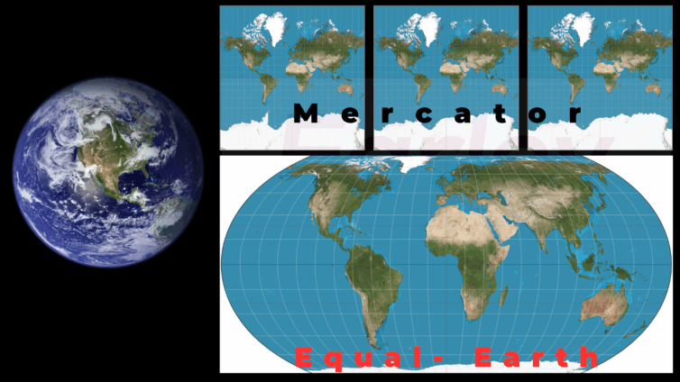
Africa is on a fierce campaign that, if successful, will see the Mercator map replaced with the Equal Earth map on web-based platforms, mobile apps, desktop software, and embedded systems for our home planet, Earth.
Most web-based platforms, including Google Maps, Apple Maps, and Bing Maps, still use the 16th-century Mercator projection for their maps.
The Mercator map, created in 1569 by Flemish cartographer Gerardus Mercator, was purposefully designed to facilitate navigation. Over time, however, it has been used in many other fields far beyond its original intent.
Even though this map maintains the angles and directions between geographic locations, it shrinks the actual size of continents near the equator (e.g., Africa, South America) while exaggerating areas near the poles (e.g., North America, Greenland).
This distortion does not sit well with two African civil society organisations, Africa No Filter and Speak Up Africa, which are urging policymakers, educational institutions, and media platforms to “stop using distorted projections” and promote a more accurate world map.
Their campaign, with the heartbeat slogan #CorrectTheMap, caught the attention of the African Union (AU), which has since backed the move.
“It might seem to be just a map, but in reality, it is not,” said AU Deputy Chairperson Selma Malika Haddadi.
Supporters of the campaign argue that replacing the Mercator map is a matter of correcting a historical visual injustice that has perpetuated colonial legacies and skewed perceptions of the continent's importance.
The core of their argument is now the subject of a petition awaiting determination at the United Nations Global Geospatial Information Management (UN-GGIM) body.
In the meantime, this scientific piece seeks to show the scorecard of the ‘fight’ to replace the Mercator map with the Equal Earth map; the significance of projections in mapping; the successes, the politics, and what lies ahead.
Mapping a polar-flattened sphere on paper: the Science of Projection
Our planet Earth, the third rocky planet after Mercury and Venus, respectively, in the solar system, is not a perfect sphere but rather slightly flattened at both the northern and southern poles.
As a result, mapping such a polar-flattened sphere onto a flat surface demands some key compromises.
Generally, a map is a symbolic representation of selected characteristics of a place, usually drawn on a flat surface. Maps teach about the world by showing the sizes and shapes of countries, the locations of features, and the distances between places.
Transferring information from the spherical, or ball-shaped, surface of Earth onto a flat piece of paper is called projection. Projection is a major challenge for mapmakers (cartographers), and every map has some sort of distortion.
Trying to project Earth’s surface onto a flat plane is like trying to flatten an orange peel without tearing or stretching it. In other words, transferring a three-dimensional (3D) sphere onto a two-dimensional (2D) paper will inevitably introduce distortion.
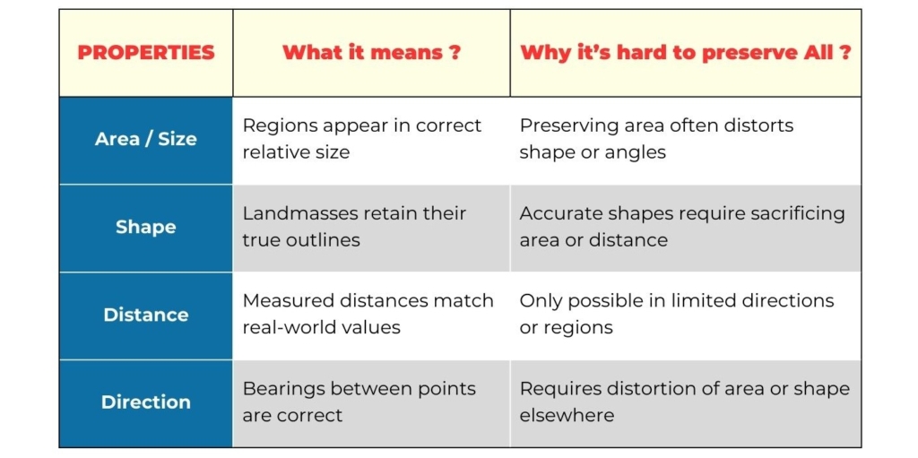
You can't mathematically preserve all geographic properties at once. Every projection must compromise between four key properties: Area/size, shape, distance and direction.
The reason all four properties cannot be preserved in a single projection is formalised in Gauss’s Theorema Egregium. It proves that you cannot map a curved surface to a flat one without distortion.
Gauss’s theorem shows that the curvature of a surface is intrinsic and can be measured using only distances and angles on the surface, without needing to view it from outside.
This means you can’t flatten a curved surface like a sphere onto a plane without distortion, because their curvatures are fundamentally different.
Mathematically, the Gaussian curvature (K) is computed from the surface’s first and second fundamental forms.
The formula proves that curvature depends only on the surface’s internal geometry, not its shape in space.
Therefore, every flat map of the Earth must distort something, either area, shape, distance, or direction, simply because it’s impossible to preserve all four simultaneously.
Map projections: The elephant in the room
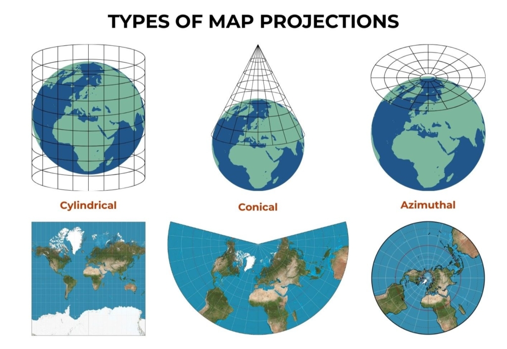
There are hundreds of map projections that can be succinctly summarised into three major types:
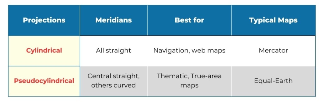
Cylindrical, Conical, and Azimuthal map projections.
The Mercator map of the Earth was made using the cylindrical projection and is well known for its distortion near the polar regions.
Figure 1 illustrates how each of these projection types differs from the others.
Cylindrical projections wrap the globe as if around a cylinder, conical projections use a cone, and azimuthal projections flatten from a single point, each with its own trade-offs in distortion.
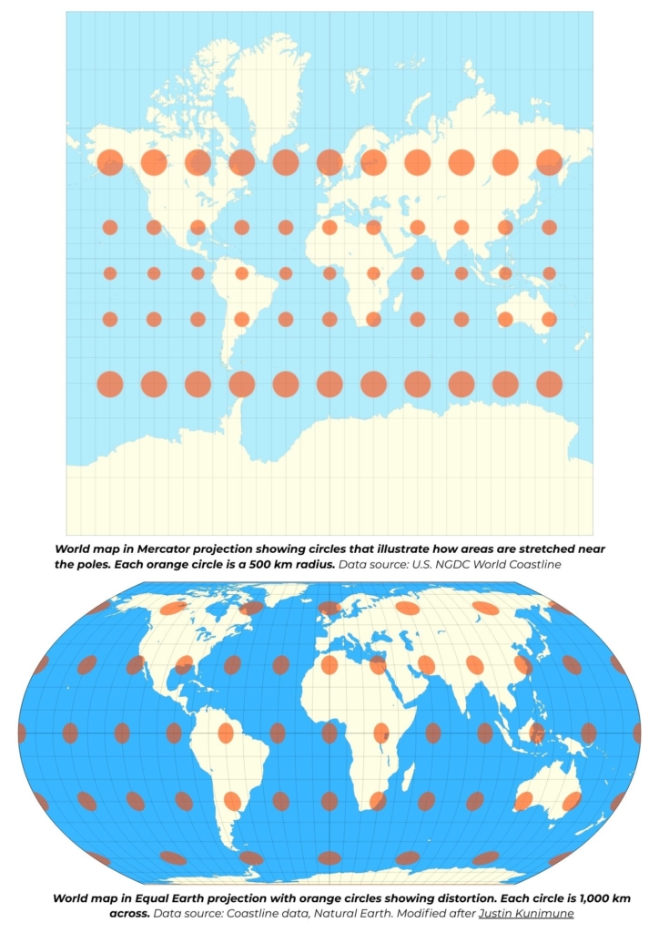
Figure 2: The Mercator Projection: Navigation’s gift, Geography’s curse
The Mercator projection, now 456 years old, remains one of the most recognisable world maps.
The top panel in Figure 2 shows the Mercator map with orange circles aligned along lines of latitude and longitude.
The size of these circles increases toward the poles while remaining smaller near the equator.
Clearly, regions closer to the poles appear much larger than they actually are. For instance, Greenland and Antarctica look disproportionately large compared to equatorial regions like Africa.
In reality, Greenland has a total area of 2,166,086 km², while Africa, the world's second-largest continent covers 30,365,000 km², making Africa fourteen times bigger than Greenland.
Yet, these surfaces are not accurately represented on the Mercator projection.
To highlight Africa’s true size, the African Union recently shared a map of Africa with the outlines
of eleven (11) major countries drawn inside it for scale, including the United States, the United Kingdom, Germany, France, Japan, Italy, Spain, Portugal, China, Peru, and India.
This visual reminder underscores how Mercator’s legacy continues to shape global perception.
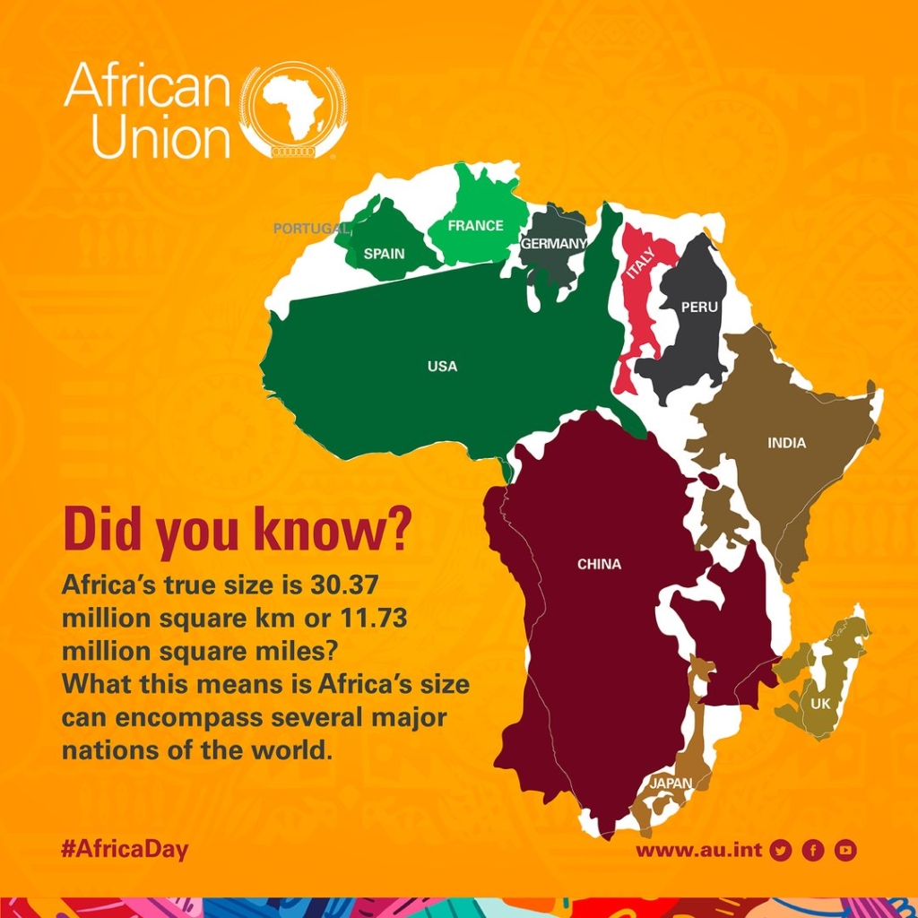
Figure 3:The Rise of the Equal-Earth Projection
The Equal-Earth map projection is an equal-area pseudocylindrical global map projection. It was invented by Bojan Šavrič, Bernhard Jenny, and Tom Patterson in 2018 to better reflect the true
proportions of continents while maintaining a visually appealing shape (bottom panel, Figure 2).
The curved sides of this projection suggest the spherical form of Earth.
The central meridian is straight, while others are curved to better balance distortion. The parallels are straight, making it easy to compare how far north or south places are from the equator.
Unlike the Mercator projection, Equal Earth ensures that each region’s relative area is preserved,
offering both fairness and realism.
The Gains thus far: NASA and the World Bank lead the way
Palpable evidence of the #CorrectTheMap campaign’s impact has been seen on two major fronts:
The National Aeronautics and Space Administration (NASA) and the World Bank.
NASA’s Goddard Institute for Space Studies (GISS) adopted the Equal-Earth projection in 2018 for its global climate anomaly maps, prioritising area accuracy and visual equity.
The World Bank followed suit in 2019, gradually integrating Equal Earth into its thematic cartography to better represent development data across regions.
These early adoptions mark a slow but significant shift toward a more balanced worldview, literally and metaphorically.
The political ghost in Mapping
In his August 2020 article “The Map Is Never Neutral,” Walker D. Mills argues that maps are often “political arguments,” and therefore, strategists must learn to interpret them as such.
He illustrates this point with several examples: Morocco has used maps to dispute its border with
Algeria and justify its effective annexation of Western Sahara (Zunes & Mundy, 2010).
Similarly, Guatemala refuses to recognise its boundary with Belize, while Argentina continues to claim the
Falkland Islands, known locally as the Islas Malvinas, on its national maps (Neuman, 2012).
Mills’ observations echo those of Hartley, who noted that “as much as guns and warships, maps
have been weapons of imperialism… used to legitimise the reality of conquest and empire.”
Maps have always carried political weight, and nowhere is this more evident today than in debates over whether or not the ongoing Russia–Ukraine war could lead to a redrawing of Ukraine’s borders.
As the conflict continues to reshape geopolitical realities, it raises the difficult question of who ultimately gets to decide how a nation is mapped.
These perspectives, among others, underscore the historical and ongoing use of cartography as a means of control and persuasion. With the rise of digital mapping technologies, the potential for maps to shape political narratives and even deceive has only intensified.
It is therefore not far-fetched to argue that the persistent use of the Mercator projection carries a subtle layer of political undertone, one that continues to reinforce historical hierarchies of power and perception.
Changing to a true view of our planet, Earth
As the world awaits the opinion and directive from the United Nations Global Geospatial Information Management (UN-GGIM), it would be precipitous to conclude that the Mercator map has outlived its purpose.
The Mercator retains its usefulness in the world of sea navigation, the purpose for which it was made. However, after more than four and a half centuries of use, it behoves the world to embrace change.
A change to the Equal Earth projection, one that maps the continents and countries of our planet respecting their true sizes.
A more accurate change, as in the eye of a bird flying over these vast landmasses.
A change to an Equal Earth map that is more just, devoid of historical visual injustice.
A change that presents a world map to a young girl in New Cairo City from a neutral and educational point of view.
A change that reassures a primary school boy in Ho, Volta Region, that a map of Africa made in Ghana is the same as that used by a teacher in Greenland.
A change that reflects how much knowledge we have acquired over these past 456 years of mapping, how much data we have collected from numerous satellites and through space missions.
A change that resonates with our present realities.
The writer, Eli Djomekou is a Science Communicator and Graduate in Earth and Planetary
Sciences.
Latest Stories
-
Anthony Joshua declines showdown with Tyson Fury but admits they ‘probably’ clash next
6 minutes -
Tyson Fury dominates Makhmudov, calls out Joshua next
26 minutes -
I have supported highway authority financially to fix roads in my constituency – A Plus
2 hours -
US, Iran fail to reach peace agreement after marathon talks in Pakistan
2 hours -
ECG kicks off Phase Two of transformer upgrades at Lashibi; brief outages expected
2 hours -
Port crises loom as 11,000 drivers threaten four-day strike
3 hours -
A source of excellence across generations – Vice President Opoku-Agyemang lauds Mfantsipim
4 hours -
(Photos) Mfantsipim School launches historic 150th anniversary
5 hours -
Knights and Ladies of Marshall group backs Catholic Bishops’ stance on anti-LGBTQ+
5 hours -
Bright Simons writes: All the Filla in the Ibrahim Mahama/E&P – Gold Fields Saga
6 hours -
Monetise Idiocy In Ghana
6 hours -
The Ghanaian prophet and the mysterious death of his scottish wife Charmain Speirs
7 hours -
Nearly 400 sentenced in Nigeria for links to militant Islamists
7 hours -
Ghana’s recovery supported by gold strength despite global oil price pressures – Standard Bank Research
7 hours -
Methodist Church hails Mfantsipim@150; calls for “fresh consecration” to excellence
8 hours