

Audio By Carbonatix
Before there were commercials and whole branding exercises hailing the notch on the Apple iPhone, there was a long row of iPhone XS devices in the lobby of the Steve Jobs Theater.
The iPhone XS was part of the second generation of notched iPhones, so it was all kind of about the notch — but it was also about the fancy OLED display that showed off perfect blacks compared to the XR’s traditional LED. Which is why Apple put a vibrant wallpaper with bright pops of color on the XS and the notch disappeared into the perfect black of the OLED display.
There was something timid about the choice to hide it in the wallpaper, like Apple wasn’t quite as confident of its now fairly iconic screen cutout. With the iPhone 14 Pro, it looks like Apple has finally figured it out.
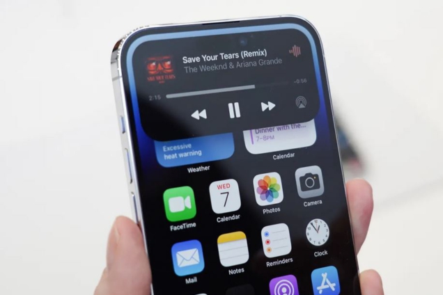
It’s the “Dynamic Island,” a black contextual box that will now appear around the iPhone 14’s cutout, inviting you to toggle DND mode, monitor the length of your phone calls, check how much life is left in your AirPods, or even pop up a sports score.
This last one doesn’t really matter to me, but apparently, a lot of you love sports and Apple has decided to give you lots of very pretty ways to monitor your sports. The box pops up with a little animation. It’s smooth and pleasant in the way the best user interface animations are. I looked at it and immediately had the urge to fidget with it, long-pressing to open a widget or just tapping on it to activate and deactivate the Dynamic Island.
/cdn.vox-cdn.com/uploads/chorus_asset/file/24002970/notch_animation.gif)
Which, wow. The Dynamic Island has just the goofiest name, but it feels like a vital new part of Apple’s design language. It is kind of like notifications and the contextual phone call menu all wrapped up in one and fully, seemingly beautifully, integrated with the phone’s pitch-black cutout containing the camera. During the video showcasing the new design, Apple said it could do away with the notch because it managed to shrink the TrueDepth camera array.
Five years ago, there was no way to shrink the camera array, which included a camera, dot projector, microphone, speaker, ambient light sensor, proximity sensor, flood illuminator, and infrared camera. It had to be able to handle phone calls, do Face ID, and take really good selfies.
At the time, Apple had two choices: keep a big bezel that would instantly make the phone look ugly and old-fashioned next to Samsung’s offerings or go for the notch. The notch would make the phone more expensive, as adding a notch to an OLED display increased the price. But the costliness of the move also made it feel just a little more luxurious, kind of like cars opting for leather interiors when cloth does the job just as well and is cheaper.
Yet it always felt like Apple struggled to embrace the notch. It put it in there, and it told developers to be thoughtful about incorporating it into their own designs, but it seemed to struggle to take its own advice. All that space around the notch never seemed to do quite what you wanted. One of the biggest pain points was the battery percentage. Until iOS 16, there was no way to check the battery percentage on your phone at a glance. You either needed a widget or you had to swipe down. With iOS 16, Apple finally brought the battery percentage indicator back, but the number was kind of ugly, and it meant losing a visual indication of battery level on the battery icon itself.
:no_upscale()/cdn.vox-cdn.com/uploads/chorus_asset/file/24003664/DSCF9249.JPG)
:no_upscale()/cdn.vox-cdn.com/uploads/chorus_asset/file/23931054/IMG_0379.jpg)
Pre-notch, that status bar on the iPhone did some work. It didn’t just tell you the time and the battery life of your phone in exceptional detail; it also told you what kind of network you were connected to and whether you had Bluetooth activated or a VPN connected. You would even see a little headphones indicator when music was playing.
To make room for the notch, Apple moved all of that and required you to handle your phone more. You now have to swipe and flip and tap to see things you used to be able to see at a glance.
The Dynamic Island likely won’t solve the problem the notch originally presented, but it does seem to suggest that Apple realized we want that stuff and don’t want to have to zoom around the phone UI like a wizard to get it.
The Dynamic Island (I will never stop laughing at that name) feels almost like an exaggerated notch. Instead of dancing around the black bit at the top of the phone, Apple is expanding it, morphing it on a whim to help it address problems the notch used to create.
Latest Stories
-
UTAG-UG threatens strike on October 19 over unpaid allowance
25 seconds -
Let The Constitution direct Chieftaincy to deliver “All Development Is Local”
1 hour -
John Jinapor outlines renewable energy, nuclear power priorities for 2027
2 hours -
Ghana explores centre of excellence for hearing, communication and cochlear implant care
3 hours -
Schizophrenia-related disorders lead mental health cases recorded in Ghana
3 hours -
Dutch authorities enlist Ghana in hunt for fugitive drug lord Bolle Jos
3 hours -
Ghana housing finance conference adopts communiqué to improve affordable housing access
8 hours -
Special Initiatives Minister urges Wa Technical Institute to enrol more girls as EU-backed solar training lab opens
8 hours -
In the matter of my first year at the Bar
8 hours -
ActionAid Ghana calls for an end to child marriage, greater investment in girls’ rights
8 hours -
Newsfile to tackle World Cup visa scandal, beach demolitions, education strikes, BRICS bid
9 hours -
UK-Ghana Trade & Investment Summit: Trade Resource Centre to help businesses maximise UK-Ghana trade opportunities
9 hours -
Embassy of Denmark celebrates World Maritime Day
9 hours -
Linking LEAP to productive inclusion could cut extreme poverty by 2030 – UNICEF
10 hours -
Trade Ministry backs use of creative arts to rehabilitate prison inmates
10 hours